SMG’s identity connects technology with human intelligence. The logo merges a geometric wordmark and a semi-rounded picture mark to convey movement and precision without feeling aggressive.
The concept
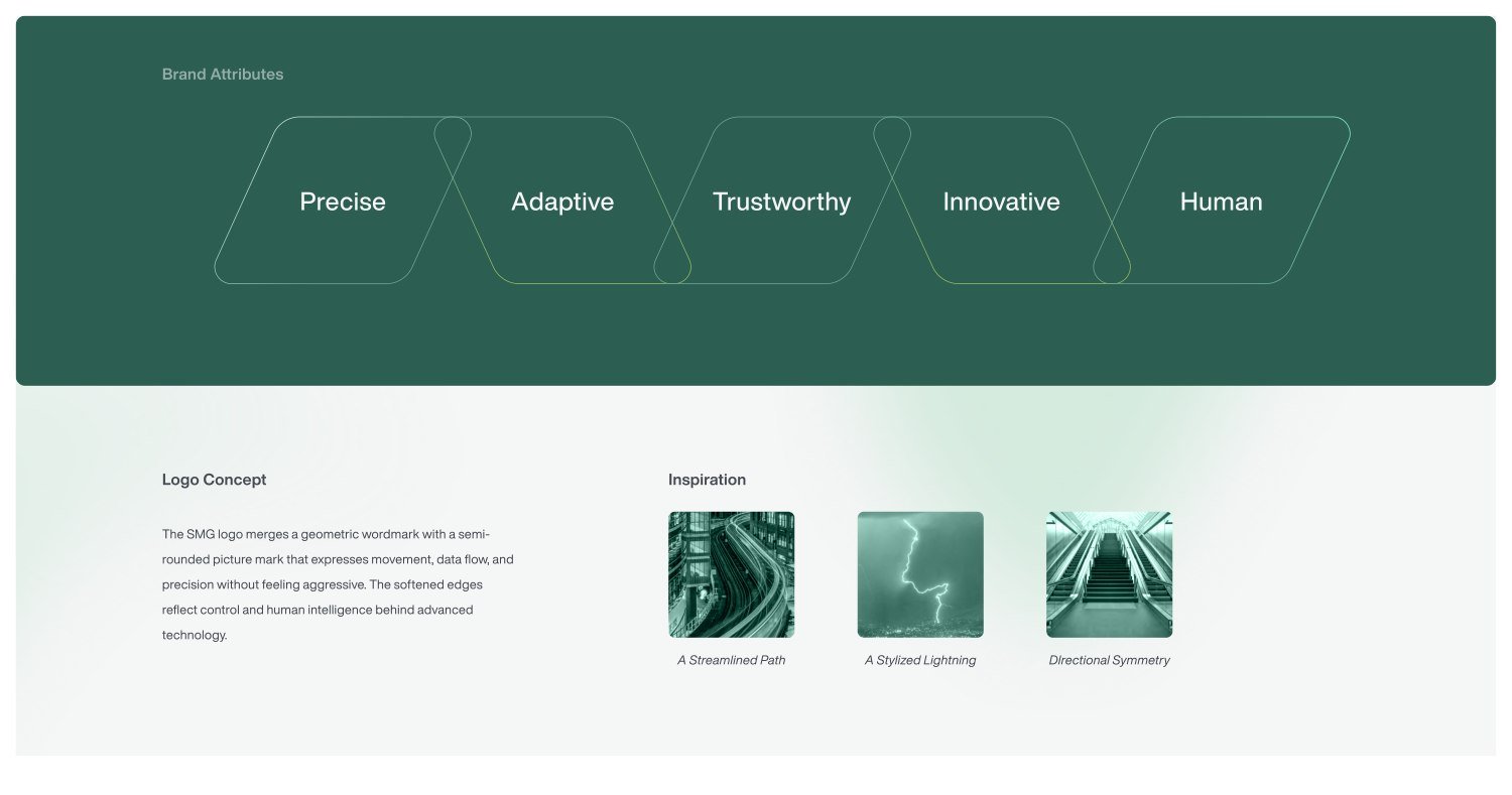
A streamlined path, stylized lightning, and directional symmetry informed the mark. Softened edges suggest control and adaptability.
From mark to application
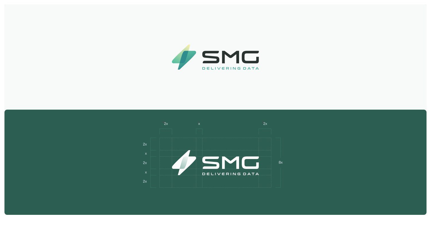
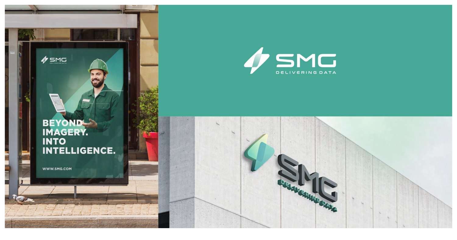
The system is built around five attributes: precise, adaptive, trustworthy, innovative, and human. The portfolio shows logo construction and applications across signage and advertising.
A collection of logo designs from my portfolio. This selection shows a range of approaches to wordmarks, symbols, geometry, and negative space.
Selected explorations
The collection includes marks such as Playmakr, Ellies, Intellese, Fastpress, Stonebridge, and Prochamps. Each image is drawn directly from the supplied portfolio.
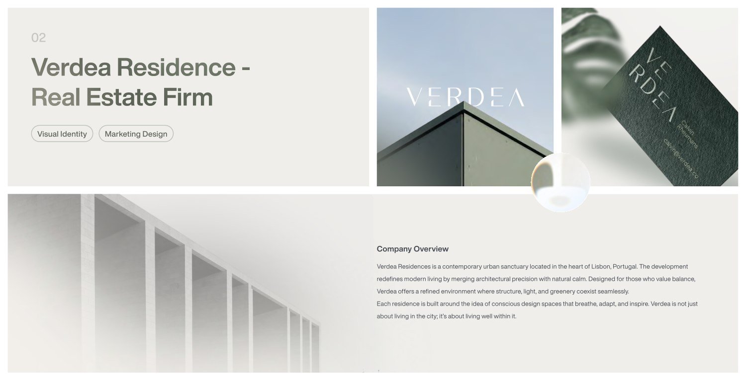
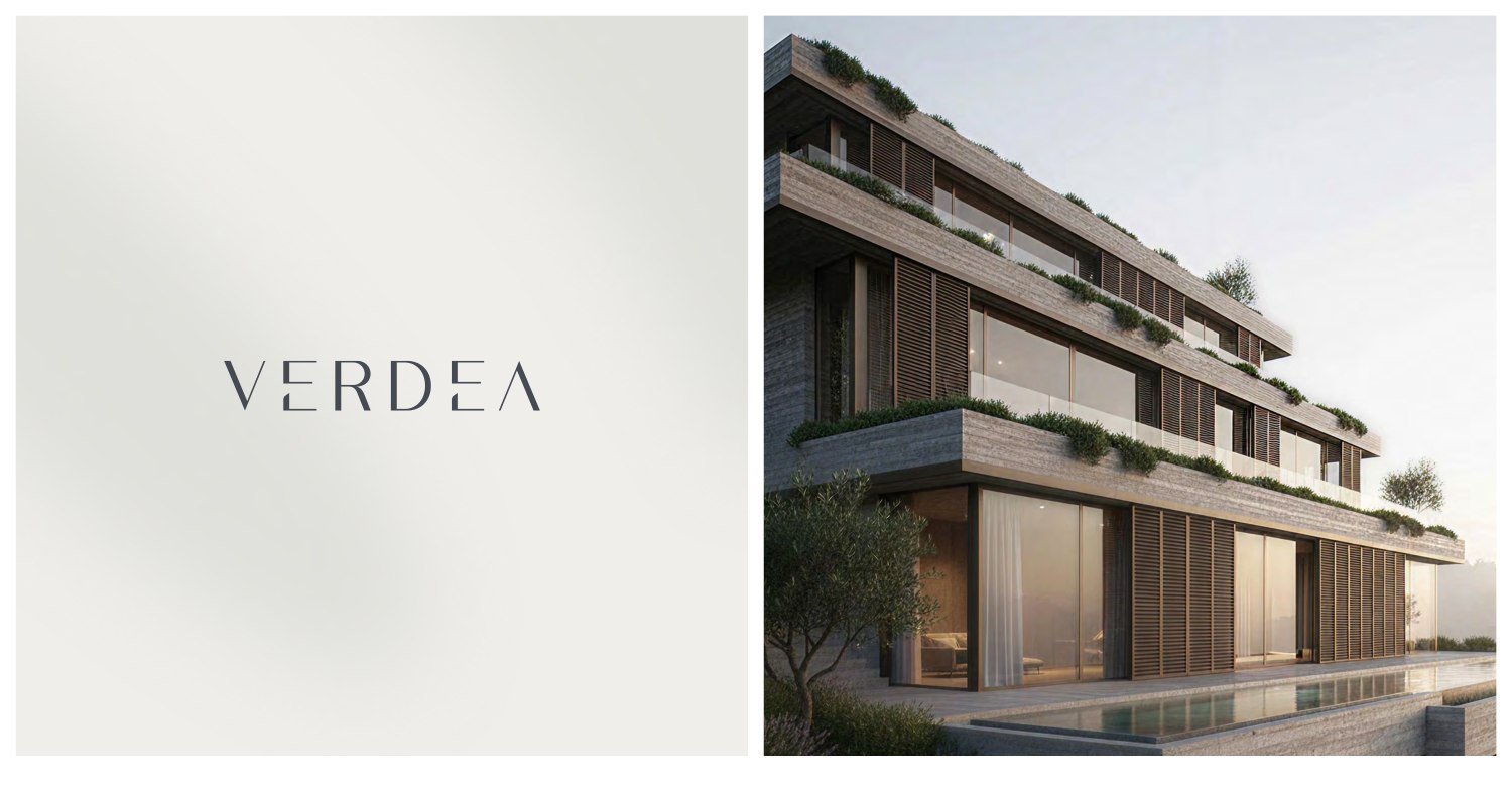
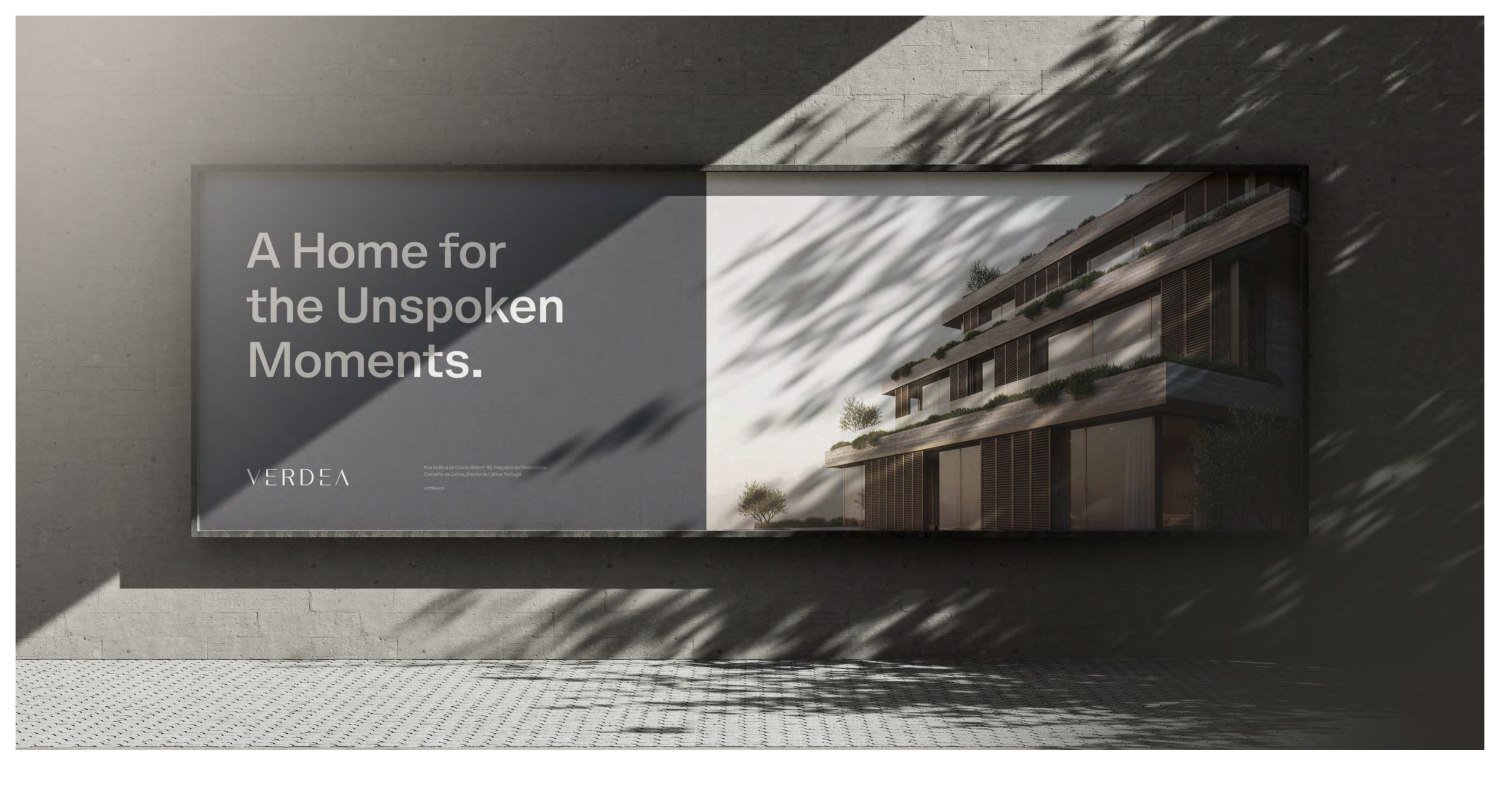
Verdea Residence is a concept identity for a contemporary urban sanctuary in Lisbon. Its visual language brings architectural precision together with natural calm.
The direction
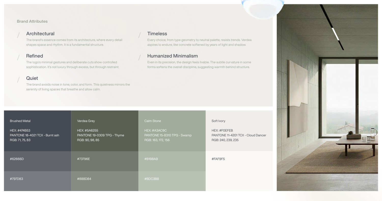
Architectural, timeless, refined, humanized minimalism, and quiet. These attributes guide an identity that communicates quality through restraint.
A living visual system
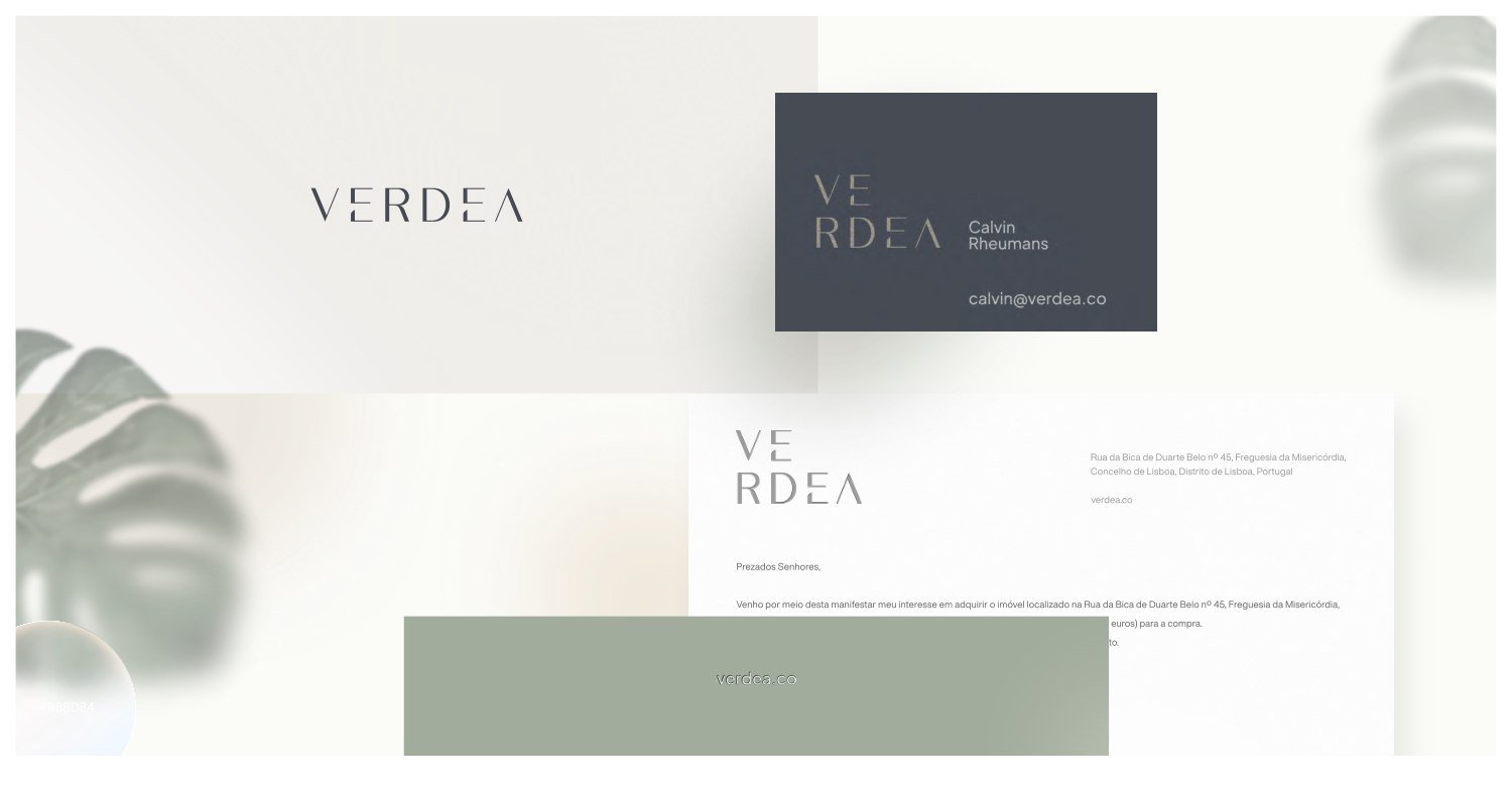
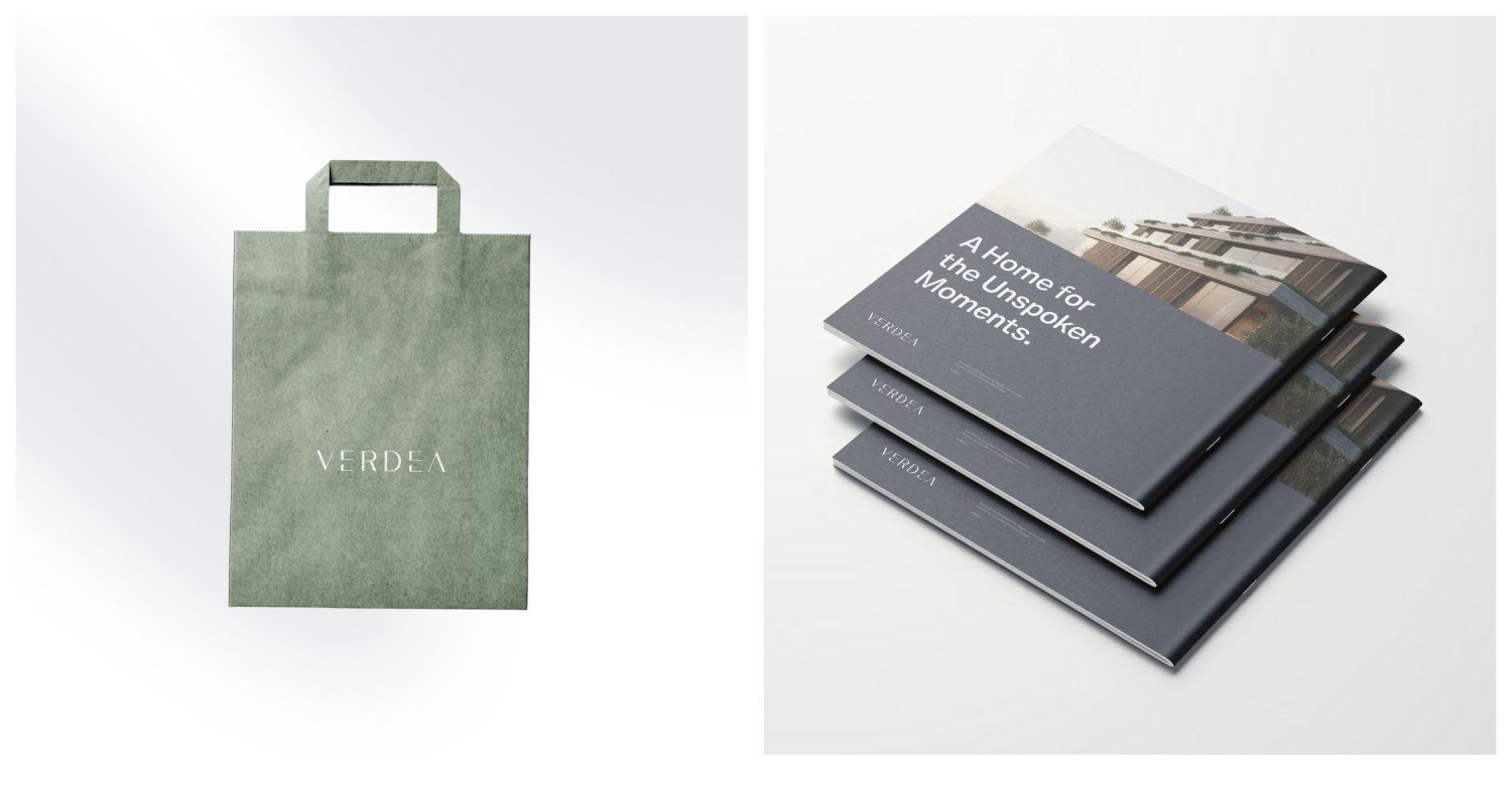
The wordmark uses deliberate geometry and subtle curves. Verdea Grey, Calm Stone, Soft Ivory, and Brushed Metal form a muted palette. The identity extends into stationery, signage, and printed marketing materials.
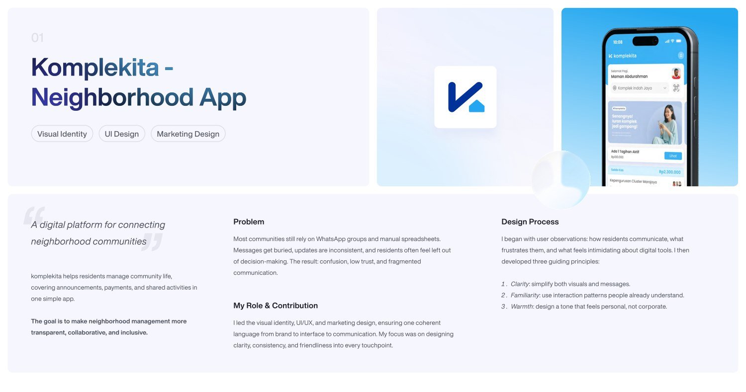
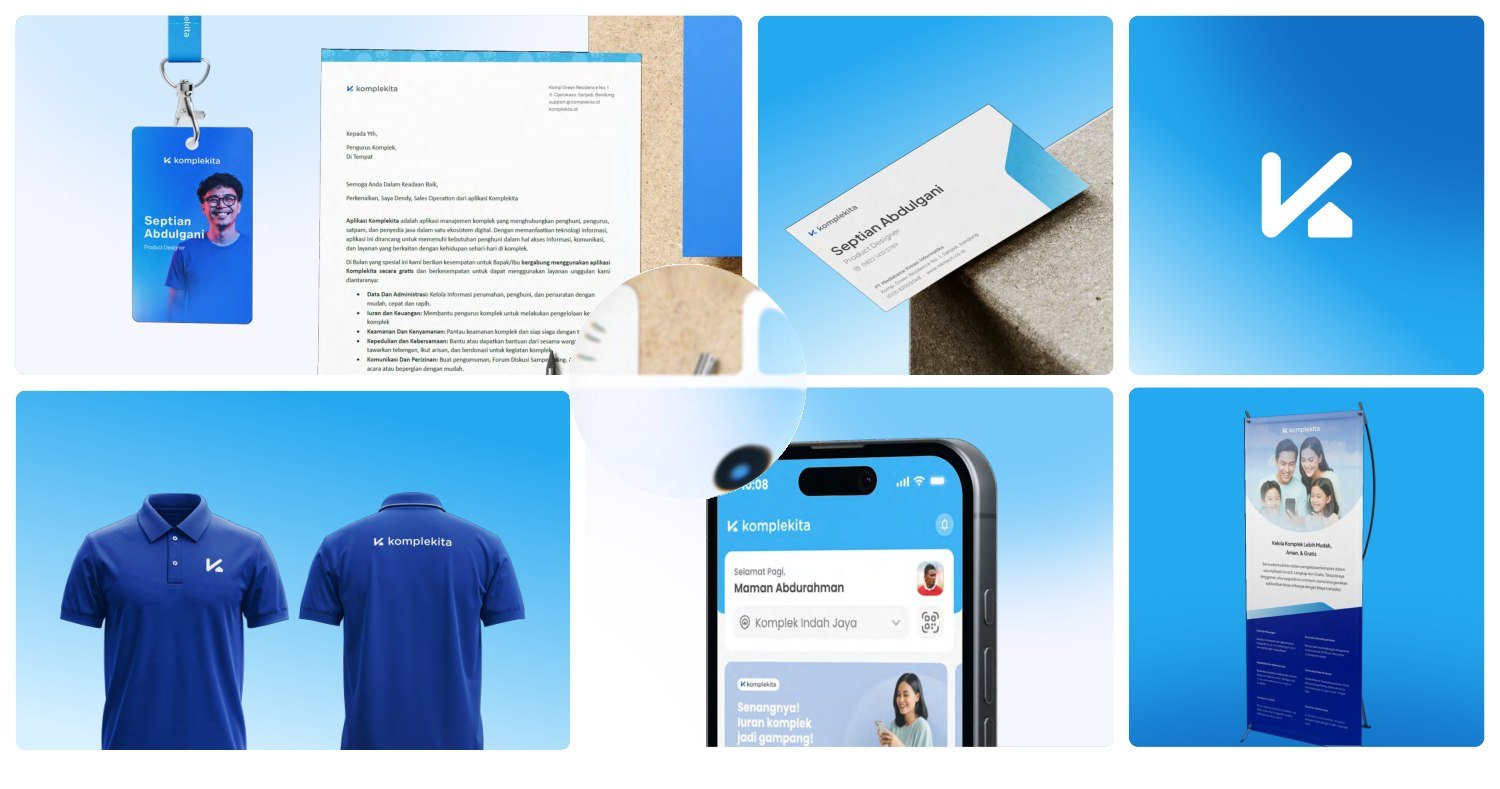
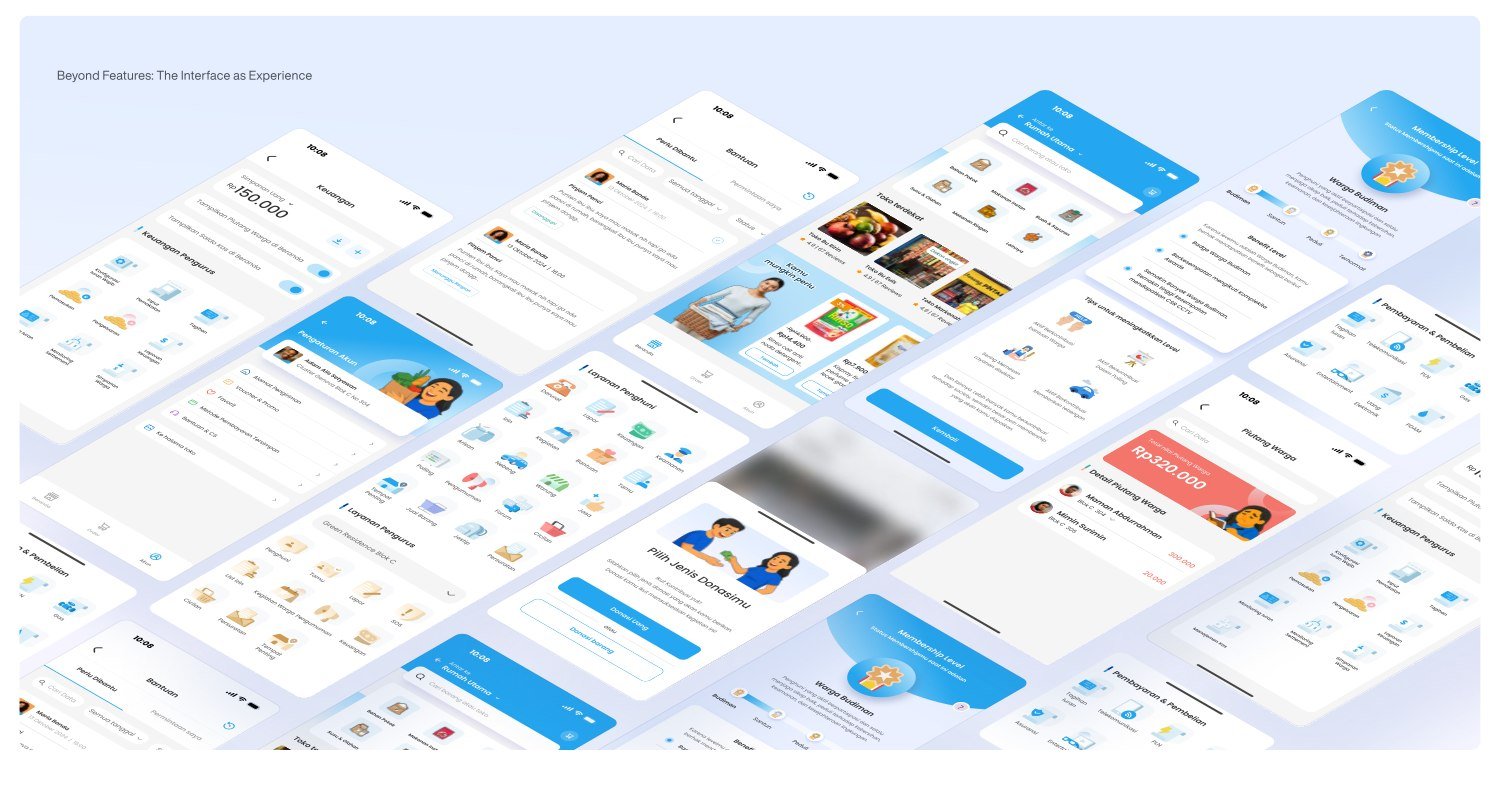
Komplekita is a digital platform for neighborhood communities. It brings announcements, payments, and shared activities into one app. I led its visual identity, UI/UX, and marketing design to create a consistent language across the brand and product.
The challenge
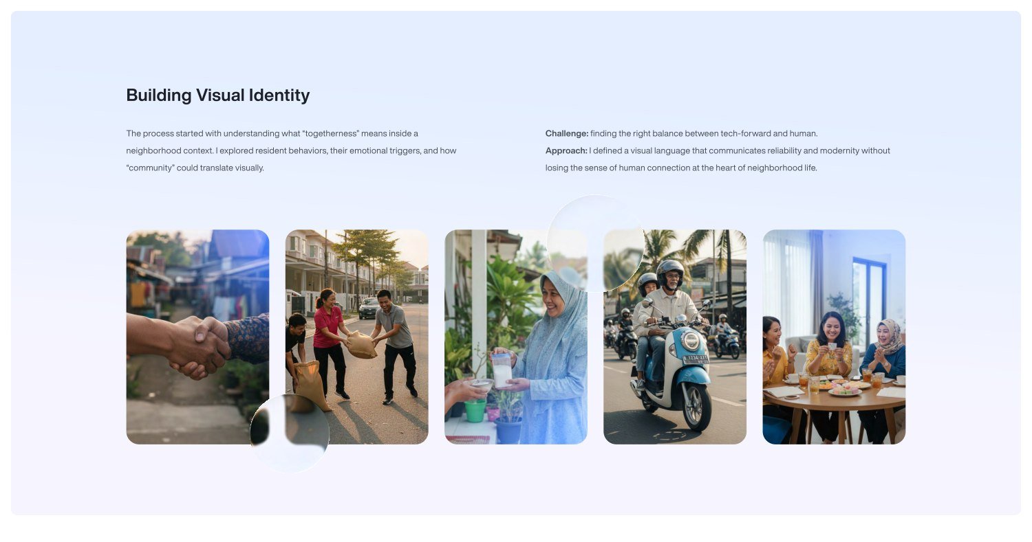
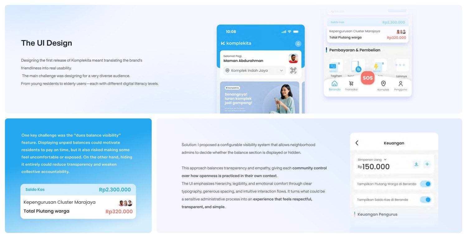
Residents and neighborhood administrators relied on WhatsApp groups and manual spreadsheets. Messages got buried, updates became inconsistent, and residents could feel left out of decisions. The interface also needed to work for people with different levels of digital literacy.
One idea across every touchpoint
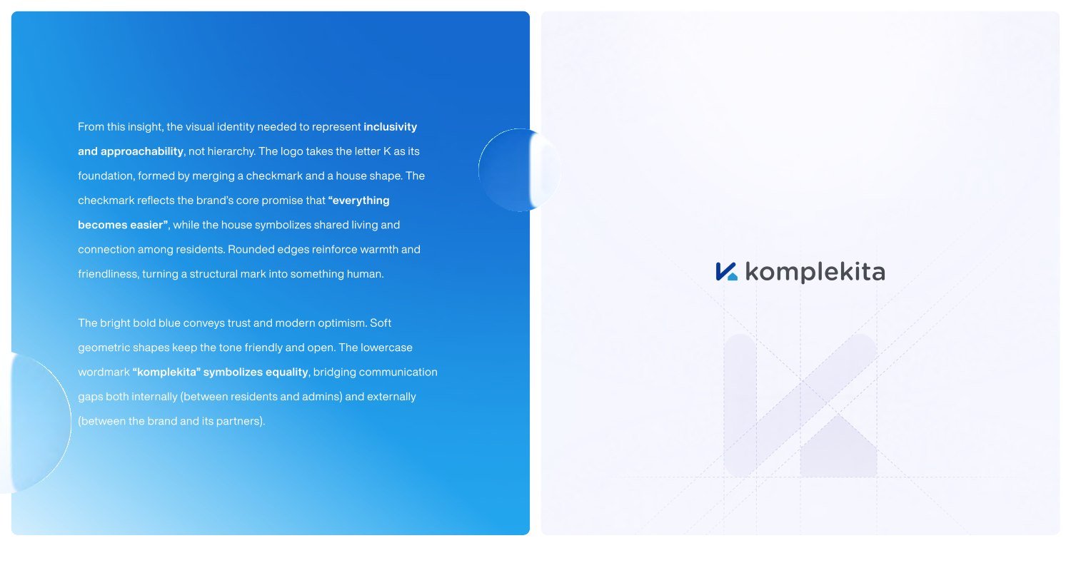
User observations informed three principles: clarity, familiarity, and warmth. The identity combines a checkmark and a house within the letter K. Rounded edges, bold blue, and a lowercase wordmark express approachable, inclusive community life.
Transparency with empathy
I proposed configurable visibility for unpaid dues. Neighborhood administrators can choose whether to display the balance section, giving each community control over how it practices transparency.
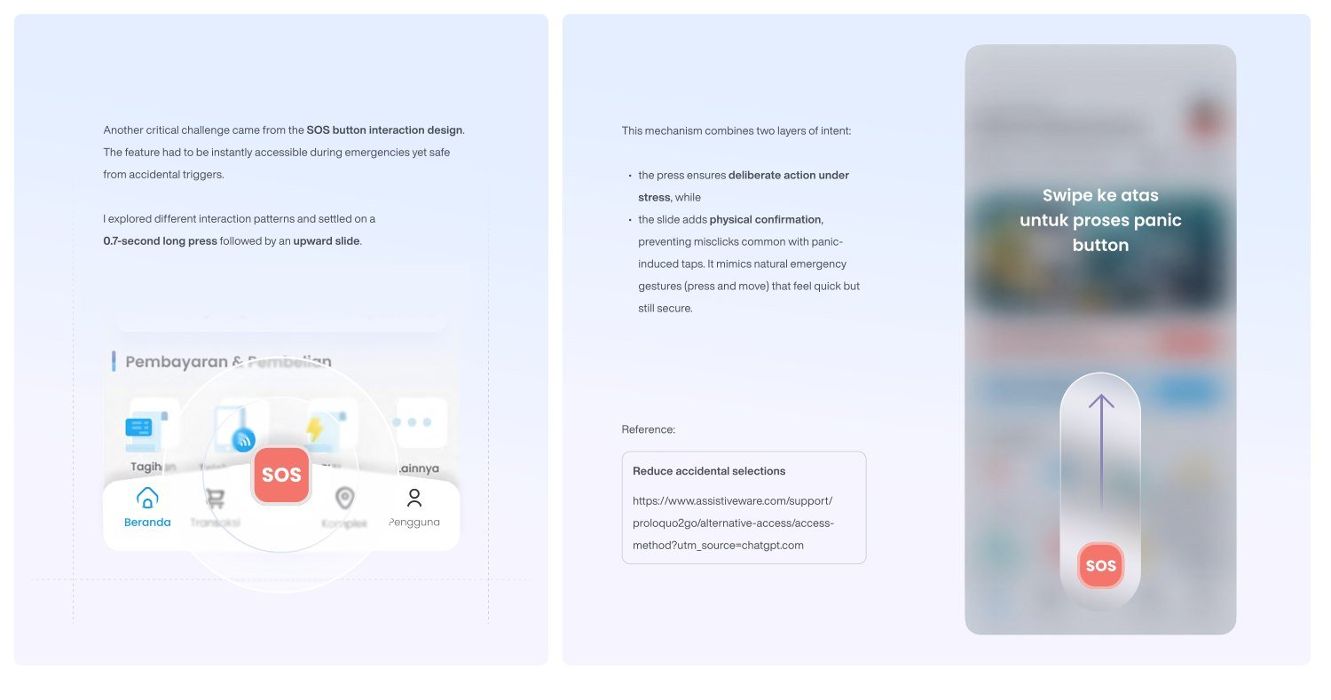
Deliberate emergency interaction
For SOS, I explored a 0.7-second long press followed by an upward slide. This design aims to make activation intentional while reducing accidental triggers. It is presented here as a design decision, not a measured safety outcome.